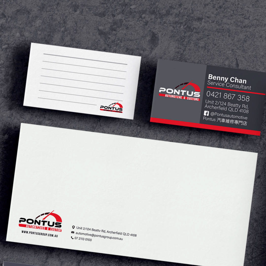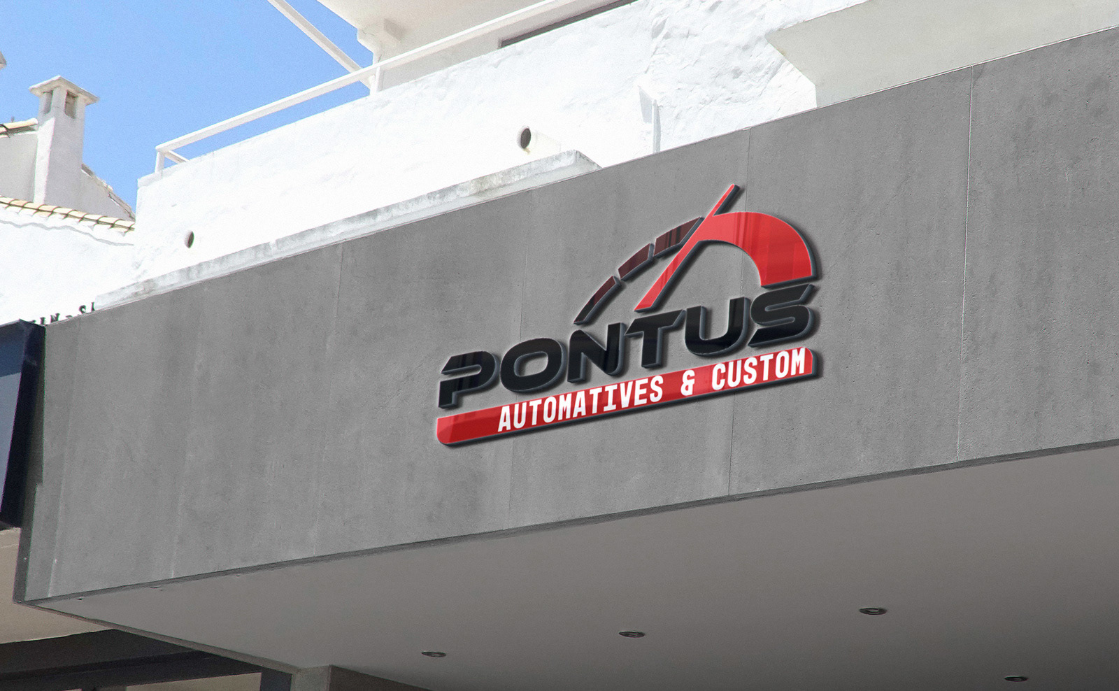
Pontus Automotives & Custom
Logo & Stationery design
Adobe Illustrator + Photoshop
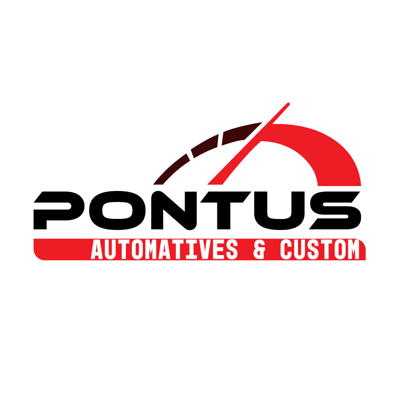
This version of the logo is modified from an unsatisfied design. The client was not happy with the overall aesthetic of the original design, which was suffering from inconsistent styling of the logo and the font.
To make the design function, I have made the following change:
𝗥𝗲𝗺𝗼𝘃𝗲 𝗮𝗻𝗱 𝗥𝗲𝗳𝗶𝗻𝗲: In the old design there is also a car pictogram which doubled the message. Then I have refine the symbolism to be only represented by the speedometer.
𝗧𝗲𝗹𝗹 𝘁𝗵𝗲 𝘀𝘁𝗼𝗿𝘆 𝗿𝗶𝗴𝗵𝘁: I have picked a new font called "Ethnocentric" that gives out a car racing vibe, which also connects better with the business owner's background as an ex-racer.
𝗛𝗶𝗴𝗵𝗹𝗶𝗴𝗵𝘁 𝘄𝗶𝘁𝗵 𝗖𝗼𝗹𝗼𝘂𝗿: With the simplified Speedometer pictogram, a colour gradient is added to emphasize the fact that the pin is reaching the highest position, further signifying maximum performance in relation to the quality of service of the repair service.