LAVA Print & Design
Working at LAVA Print & Design I was given an opportunity to develop the branding for LAVA Print & Design, a small print shop that only relocated from a remote suburb into a urban area.
The goal of the aesthetic is build a simple, recognisable and engaging profile, creating an professional and approachable persona that represent the nature of the highly effective team working in the shop.
The goal of the aesthetic is build a simple, recognisable and engaging profile, creating an professional and approachable persona that represent the nature of the highly effective team working in the shop.
The Colours
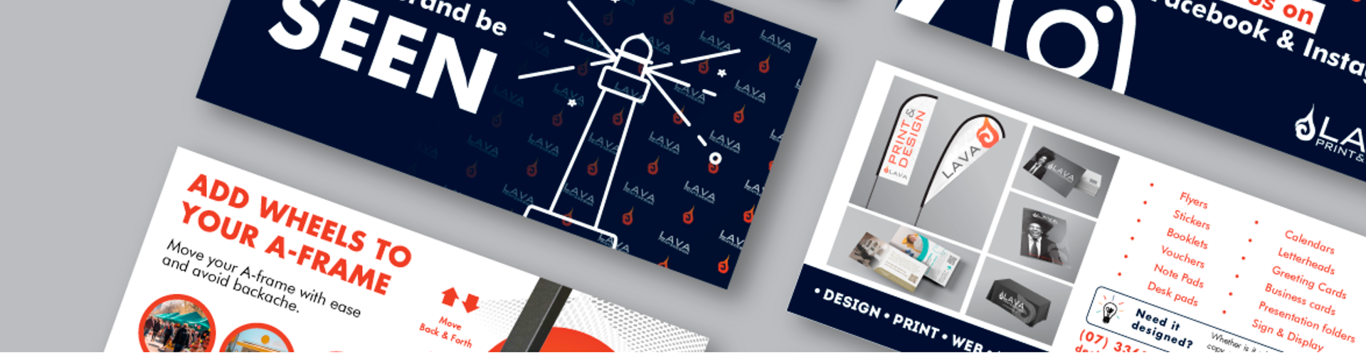
The original logo involves a hot orange and deep navy, the colours were chosen for maximising contrast with high legibility in mind.
I have derived a system from the iconic colours using the level of shade to represent the nature of the information. With more lighter colours, the post is a casual post, with a darker shade, the post is usually a more important message/ announcement.
By manipulating the level of contrast, readers receive a hint of the importance of the message.
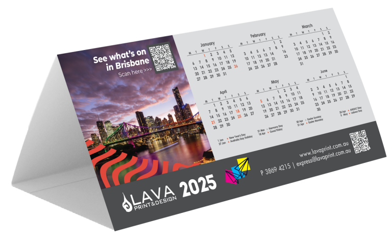
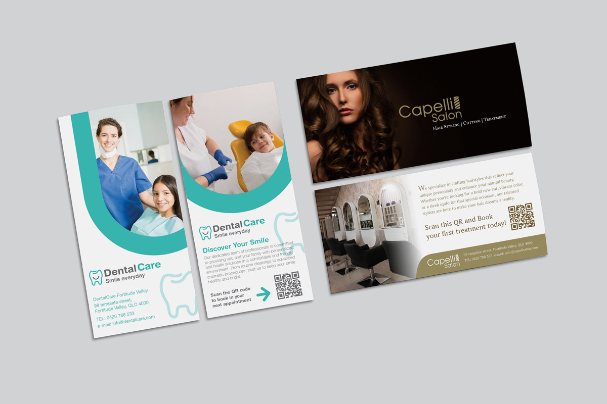
See below for some of my content creation.
See below for some of my content creation.
To see recent content, please visit this link:
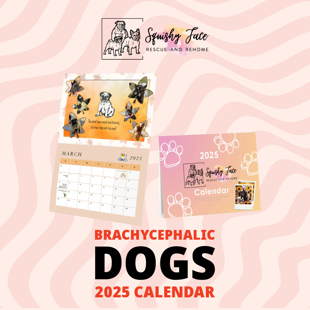
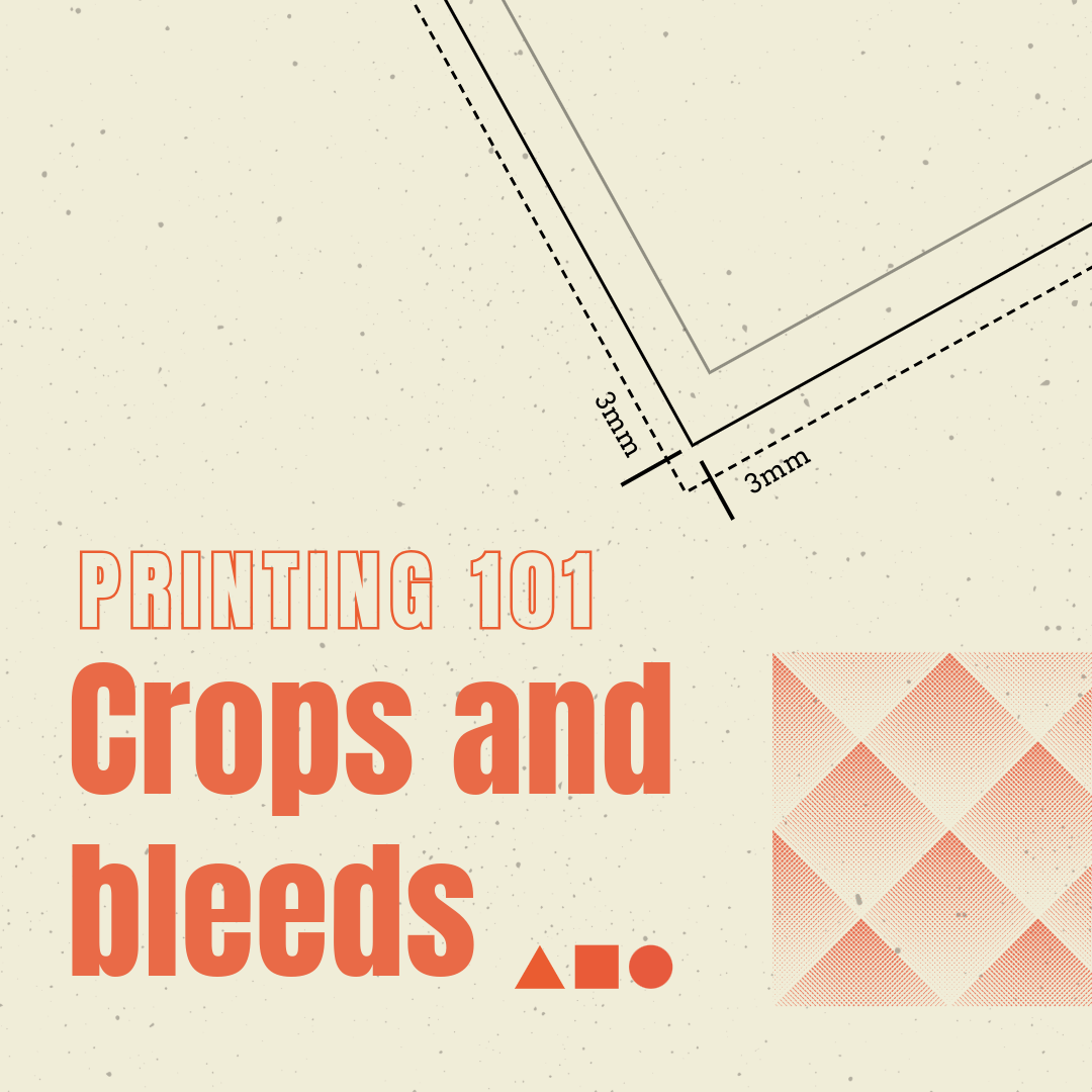

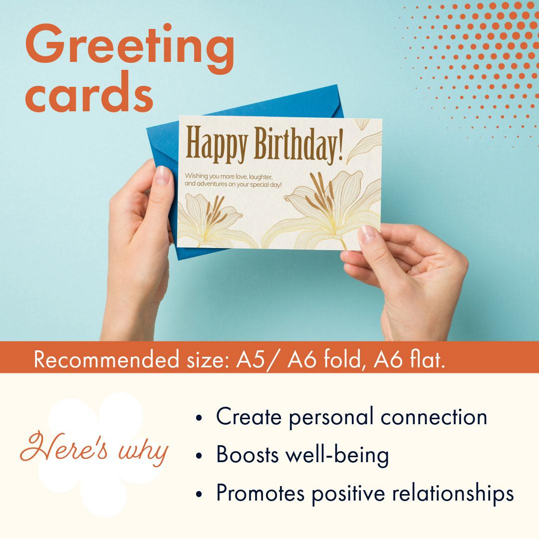
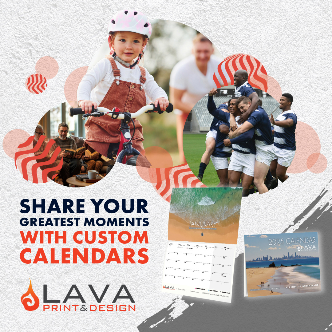
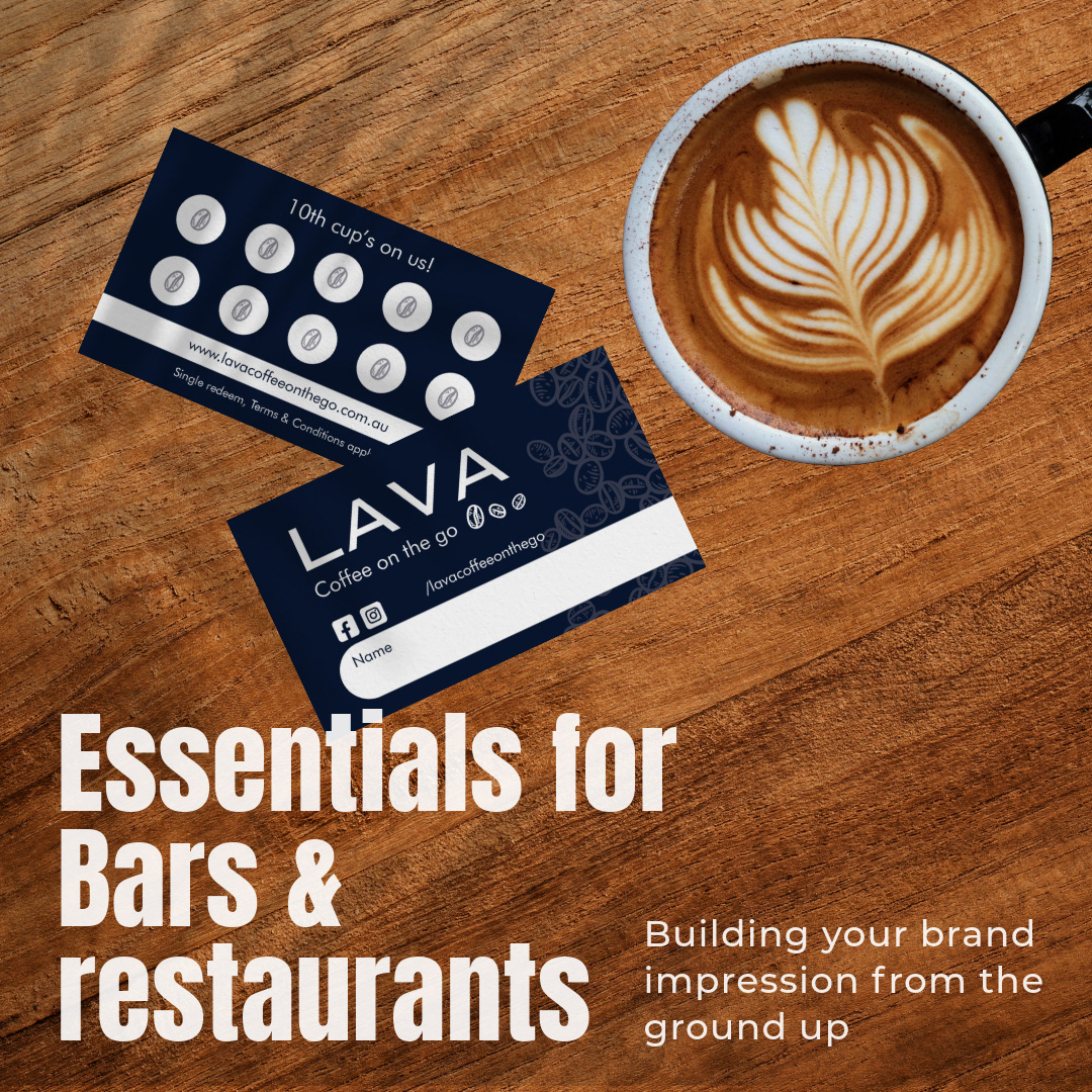
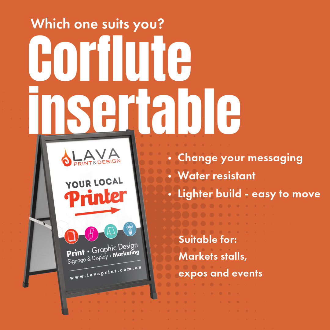

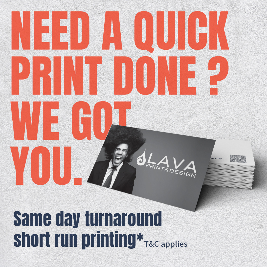
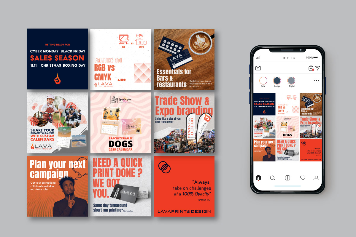
Printed design
More designs were create following to the branding. Each design are designed to promote a unique product and service provided within the shop.


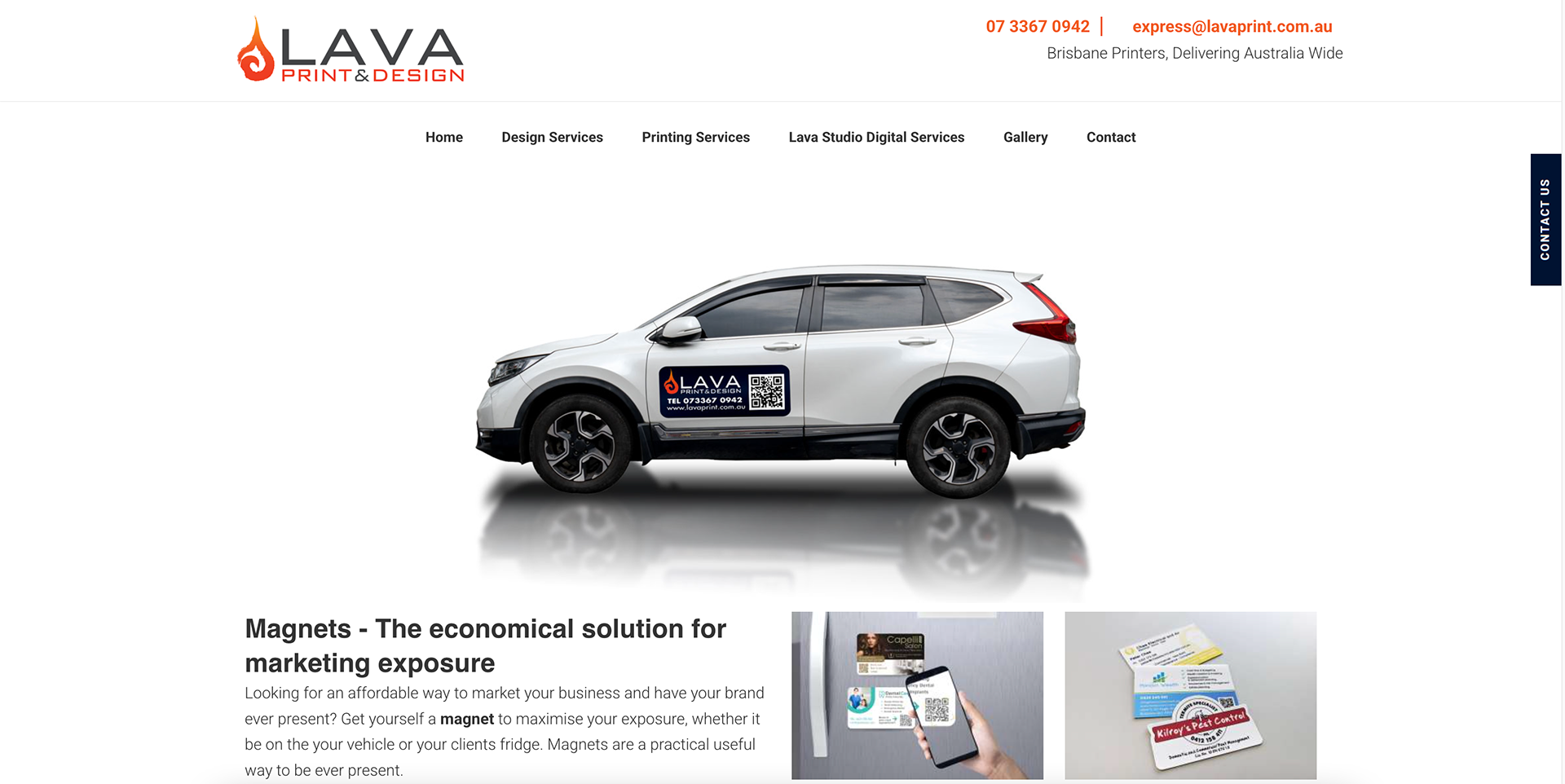
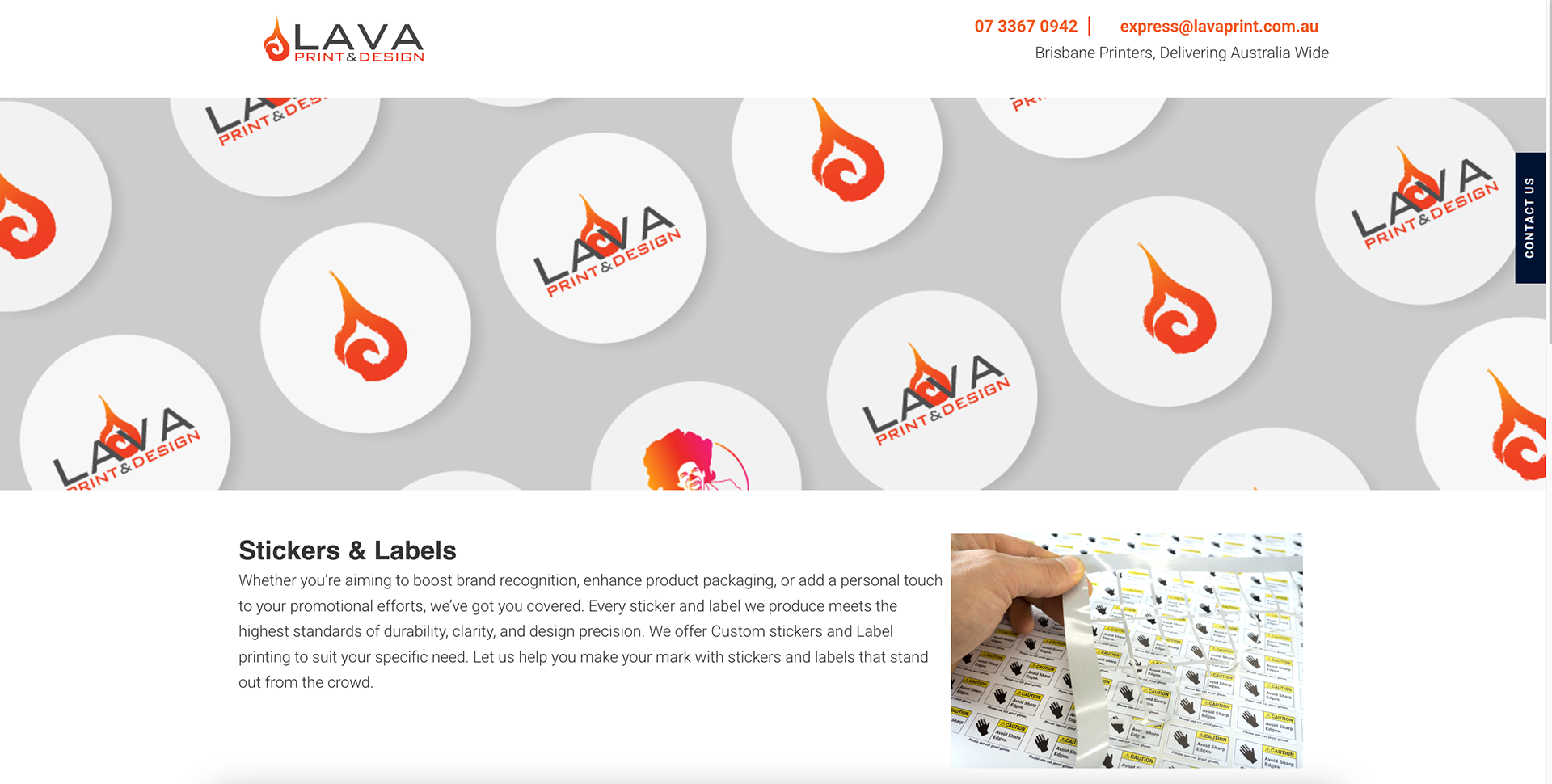
Webpage design
I have assisted the business in update & revamp the Service webpages. Not only providing a sleek and modern look but also an on-brand aesthetic throughout the website.